Key Highlights
- Android 17 introduces Google Blur across core system UI elements on Pixel phones
- Volume controls, power menu, and system sheets now feature translucent backgrounds
- Blur adapts to Dynamic Color themes and shows real-time app context
- Google continues its post-Material 3 visual evolution without major layout changes
Google is adding a blur-based system interface to Android 17 on Pixel devices, expanding its visual redesign first seen last year. The update introduces translucent UI elements across the operating system, allowing background content to remain visible while users interact with system controls. This change matters because it reshapes how Android balances usability, depth, and context without altering core functionality.
What is Google Blur in Android 17?
Google Blur refers to a new system-level visual treatment in Android 17 where solid light or dark backgrounds are replaced with subtle blur effects. These translucent layers allow users to see the wallpaper or app content beneath system UI components. Internal Android builds and system flags explicitly label this feature as “blur,” confirming it as an intentional design shift rather than an experimental tweak.
Unlike previous flat UI designs, this approach adds depth while keeping interactions lightweight and visually connected to what’s happening on screen.
Which Android 17 UI elements use blur?
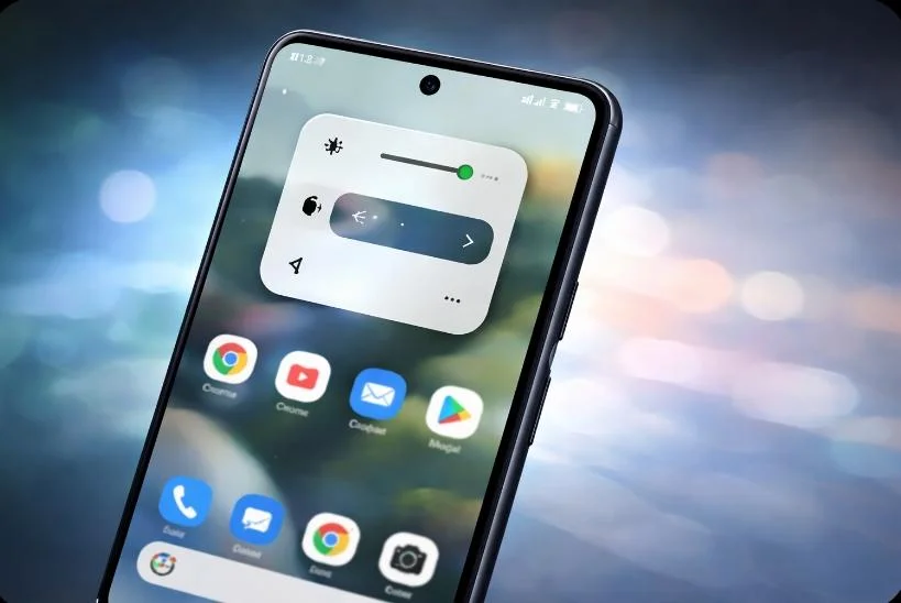
In Android 17, blur appears across several frequently used system components. The volume bar now sits inside a translucent pill-shaped container, showing background apps or the home screen underneath. The full volume panel and power menu also adopt the same blurred effect.
Additionally, system sheets that slide over apps maintain visual continuity by revealing content behind them. This ensures users remain aware of their current context rather than interacting with opaque overlays that block visibility.
How Dynamic Color affects Google Blur
The blur in Android 17 is not static. Instead, it adapts to Google’s Dynamic Color system. The translucent layers inherit subtle tints from the active theme, creating consistency across the interface. As a result, the blur feels integrated rather than decorative, aligning with Android’s Material design principles.
However, Google is keeping this change restrained. Android 17 does not overhaul layouts or navigation patterns. Most screens function the same, with blur serving as a refinement rather than a reinvention.
How Android 17 blur compares to earlier updates
Google first introduced blur in Android 16 QPR1 within the notification shade and Quick Settings. At the time, the company said blur added a sense of depth while keeping users visually connected to background apps. Android 17 extends this logic system-wide.
Compared to iOS-style glass effects, Android’s blur remains understated. It prioritizes readability and performance while subtly enhancing motion and layering.
Will apps also get blur effects?
For now, Google Blur remains limited to the operating system. Material 3 Expressive for apps does not include blur elements. It is unclear whether Google plans to extend this translucency to third-party apps in future updates.
In conclusion, Google Blur in Android 17 represents a controlled visual evolution for Pixel devices. It enhances depth, preserves context, and refines system interactions without disrupting familiar Android behavior.