Apple’s Liquid Glass UI Takes a Step Back
Apple continues refining the visual experience in iOS 26, and the latest Beta 3 release marks a significant shift from the design direction taken in Beta 2. The Liquid Glass interface—first seen in iOS 26’s early previews—is now being reined in, with frosted opacity replacing translucent depth in many apps.
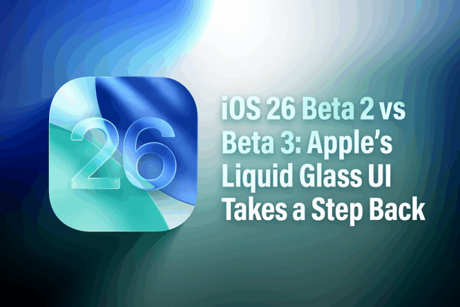
This side-by-side comparison highlights how iOS 26 Beta 3 has adjusted its user interface visuals, possibly aiming for better readability and uniformity.
Apple Music and Podcasts: From Transparent to Frosted
In Beta 2, Apple Music’s bottom navigation bar embraced transparency. It allowed background colors to shine through, giving screens a vibrant, glassy effect.
But in Beta 3, that’s changed. The nav bar now features a frosted glass finish, with less background bleed-through. Podcasts follow the same pattern—Beta 2 felt light and immersive, but Beta 3 leans heavier and more solid.
Safari: Compact View Loses Its Edge
Safari’s Compact View in Beta 2 showcased Liquid Glass at its finest. Background content shaped the URL bar’s color and feel.
In Beta 3, the effect is restrained. The URL bar is more consistent, rarely shifting based on page content. It’s still dynamic, especially in Dark Mode, but lacks the visual fluidity of the previous build.
App Store and Calendar: Opaqueness Takes Over
The App Store’s navigation bar in Beta 2 felt light and floating. Beta 3 swaps that for an almost entirely opaque look.
Similarly, Calendar sees its navigation and action buttons get darker in both Light and Dark modes. Beta 3 appears more grounded, but also less engaging.
Apple TV and Photos: Subtle Yet Noticeable Tweaks
In these two apps, Apple hasn’t gone all the way. Apple TV and Photos still retain some level of transparency, but navigation bars are now darker in tone, offering more contrast and readability.
The shift is subtle but noticeable—especially when placed side-by-side.
Keyboard, Search, and Spotlight: Contrast Comes into Play
The keyboard in Spotlight now shows slightly more background than before. But the search bar above it is darker in Beta 3.
This creates a higher contrast UI, which may aid visibility, but at the cost of uniform design harmony.
Lock Screen and Notifications: Slightly Dimmed Down
Even the Lock Screen sees minor changes. The time and notifications appear more opaque with certain backgrounds. These adjustments are small but in line with the broader Beta 3 theme—less fluid, more frosted.
Built-in Apps: Translucency Scaled Back Across the Board
In a side-by-side comparison:
- Weather, Mail, Notes, Reminders, Stocks, Settings all show darker or more solid interface bars in Beta 3.
- Maps is the outlier, showing more translucency than before—using Liquid Glass in navigation overlays.
- Camera, FaceTime, Clock, Translate remain unchanged.
- Home, Wallet, Books, Files show clear reduction in transparency.
The result? A uniform but less dynamic interface in Beta 3.
Dark Mode vs Light Mode: Transparency Still Varies
Beta 2 had more noticeable Liquid Glass layering, especially in Light Mode. In Beta 3, Apple’s adjustments feel like an attempt to balance readability and design elegance.
Dark Mode retains slightly more transparency in many areas, but Apple has still toned it down compared to Beta 2.
Beta 3’s Design Philosophy: Consistency Over Charm?
From this comparison, it’s clear: Beta 3 focuses on usability and visual consistency. However, some users argue Apple has lost part of what made Liquid Glass stand out.
Where Beta 2 felt bold, Beta 3 feels safe.
What to Expect Next?
Apple might continue refining the UI in upcoming betas. Whether that means restoring some visual drama from Beta 2—or leaning further into Beta 3’s frosted calm—remains to be seen.